Role(s)
Product Designer, Brand Designer, Logo Designer
Timeline
3 Months
Deliverable
Brand Design, Product Design, Graphic Design
Platform(s)
Adobe Illustrator, Photoshop, Indesign
Antiquitea is a collaborative project that focuses on offering refreshing old-timely teas with a modern explorative twist.
Overview
Our design team explored different types of Victorian Era teas and incorporated aspects of the theme for inspiration. Our target audience is millennials (ages 20-29) and tea lovers, seeking for a leisure place to unwind and relax.
Logo
The logo design was divided to create our own interpretation of what Antiquitea stands for. For our first round, we shared our feedback on what works and can be improved. Because our theme was modern and vintage, our next iteration focused on incorporating the black tea flower as our main symbol. The final logo is a combination of elements in our previous iterations.
Final Logo
Menu
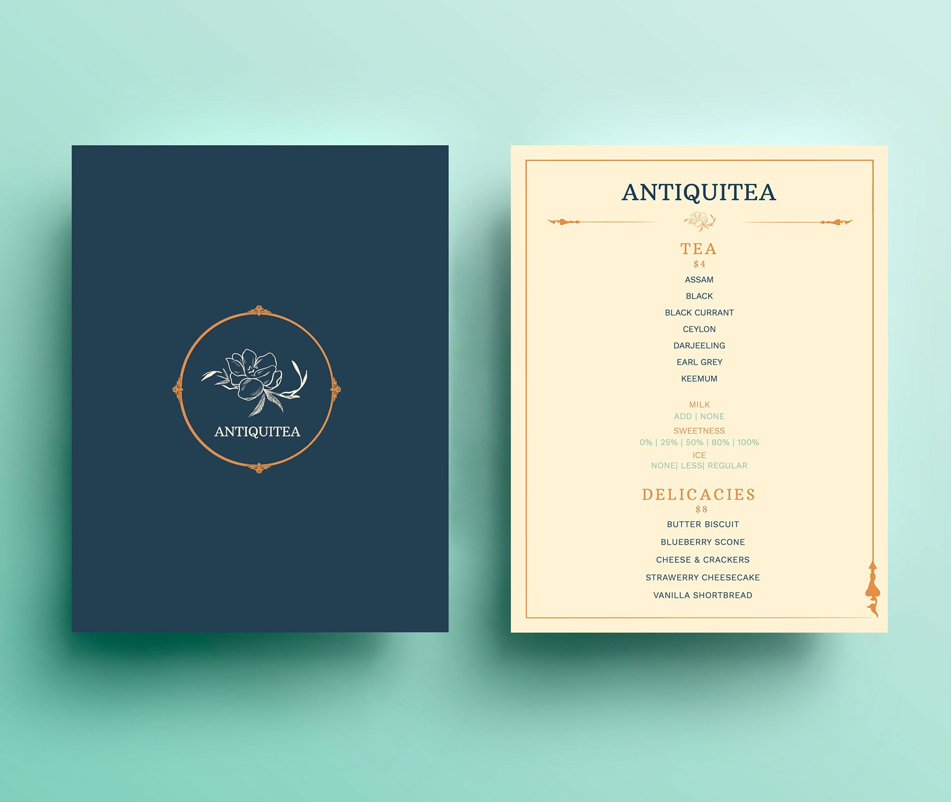
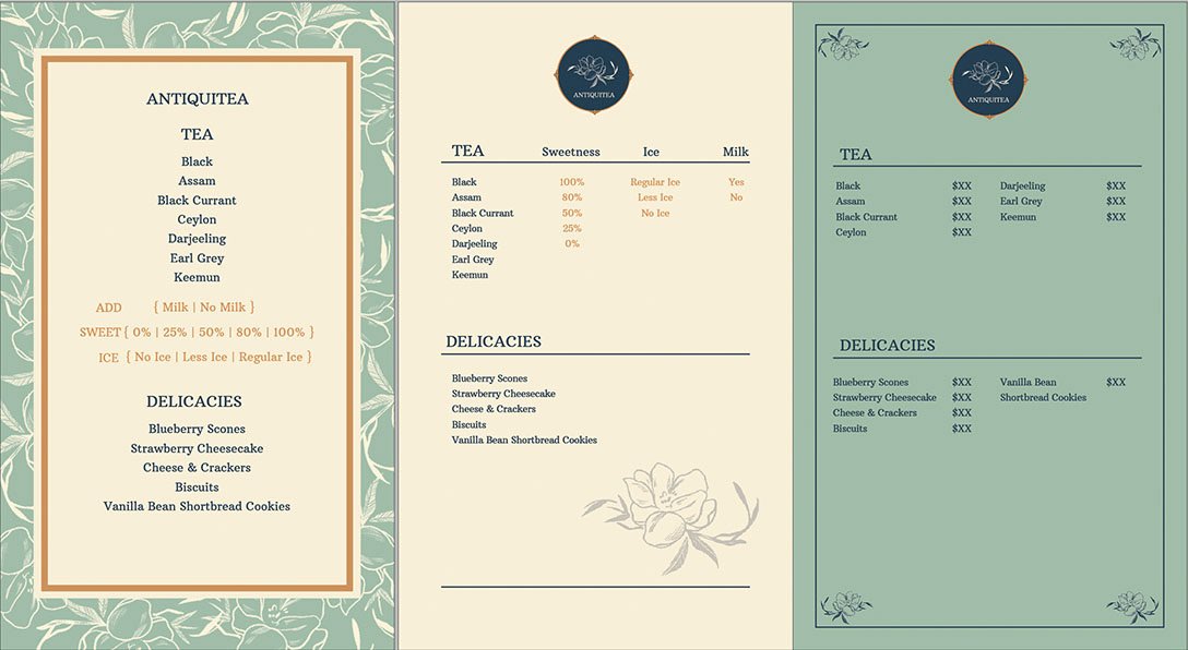
Our menu focuses on offering a simple selection of teas and delicate snacks for our customers. While playing with fancy themes and a creamy color scheme, we wanted to keep our menu layout to be modern, minimalistic, and legible.
Keeping a vertical, centered text alignment created a sense of professionalism and legibility that we wanted to maintain for our menu.
Final Menu Design
Business Card
We each iterated our own business card idea separate with certain requirements: it had to include the logo, phone number, and address of our brand. We came together to discuss afterwards and decided on the most appealing design to finalize. During this discussion, the idea of including stamp cards on the back of the business card, a feature often seen in tea stores, was suggested, so we decided to incorporate this as well to the final design.
Final Business Card Design
Website
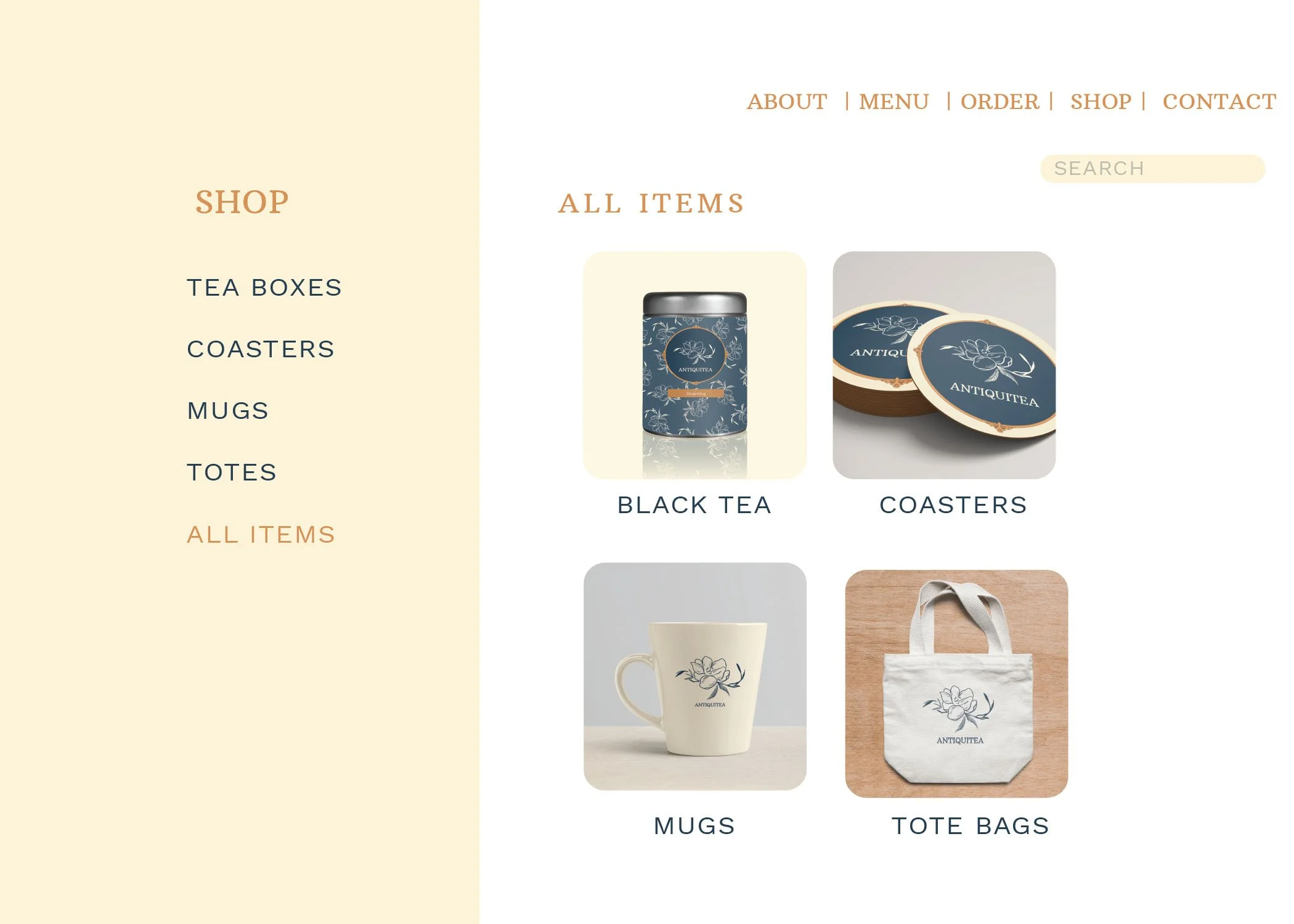
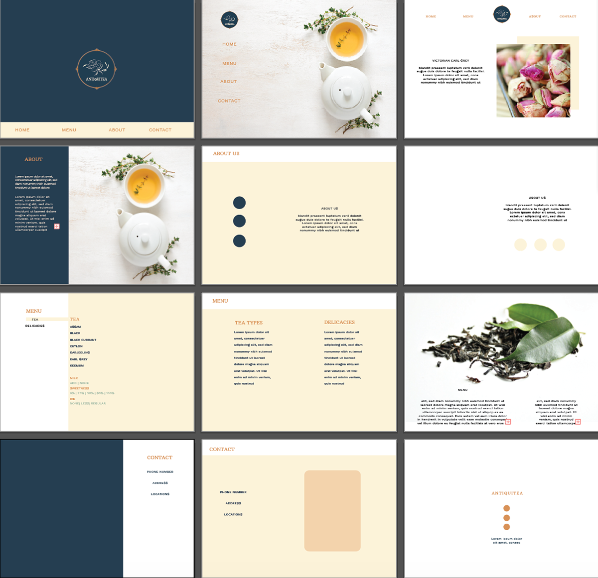
By following our theme of clashing both aspects of modern and vintage styles, we wanted Antiquitea’s website to be an accessible, coherent, and visually appealing for our audience to learn about our brand. It was a challenging thinking about the perspective of how users would navigate and interact with our pages; However, we found certain features, such as an online ordering system and a merchandise storefront, that felt fitting to include for the overall website.
The layout of the website was tricky, but we agreed that having an infinite scroll platform would be the most efficient way to present our website tabs, and make it easy to navigate and pinpoint our information.
Final Website Design


Challenges, What Worked, & the Future
We've researched different types of our tea products and make our product align coherently with our branding. This helped us maneuver over potential confusion on our identity/branding
Incorporating modern and vintage styles into one brand was a challenge for the three of us. Exploring these styles and maintaining a balance envisioned a brand that could entice longtime tea lovers and newcomers.
The logo featured a serif font with an illustrated flower, already contrasting the modern logo designs of tea stores that utilize primarily sans serif fonts and minimal shapes. We balanced this with the rest of our branding design, utilizing a sans serif font for our body texts instead as well as taking advantage of white space in our website and menu.
In the future, we hope to pitch this idea to an agency, or even turn the website to a reality.


